By M. Anger
If
you’ve ever purchased a video card there’s a good chance you’ve noticed
something about the boxes they come in: They are really, really stupid.
Sure, there are a few vendors who go out of their way to try to use a
nice-looking (or at least somewhat respectable) image for the front of
their box, but the majority of these packages look more like they
contain a cheap Korean squirt gun from the dollar store than a 300
dollar computer part. You don’t have to look very hard to find reviews
for the cards themselves, but I haven’t seen anybody review the boxes
themselves before. I have the feeling this is because people think it
would be a complete waste of time, both for the reader and the author.
Sounds great to me!
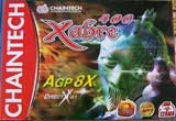
If you’ve ever purchased a video card there’s a good chance you’ve noticed something about the boxes they come in: They are really, really stupid. Sure, there are a few vendors who go out of their way to try to use a nice-looking (or at least somewhat respectable) image for the front of their box, but the majority of these packages look more like they contain a cheap Korean squirt gun from the dollar store than a 300 dollar computer part. You don’t have to look very hard to find reviews for the cards themselves, but I haven’t seen anybody review the boxes themselves before. I have the feeling this is because people think it would be a complete waste of time, both for the reader and the author. Sounds great to me!
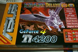
Theme: Unicorns!
Not only does this one prominently feature a unicorn (the lamest mythical creature ever to not walk the earth), but it’s a unicorn made of purple glass. If ever there was a way to make a unicorn even less tough, this would be it. Congratulations I guess.
Grade: F (Unicorns are stupid)
Design:
The color theme on this box is only slightly unpleasant; I at least have to commend Asus for not going with the traditional diarrhea brown box that many companies seem to favor.
But unfortunately even as they buck one stereotype they conform to another: The vague inspirational command. On this particular product they have chosen “Empower your imagination”. Really makes you think doesn’t it? Nope.
Grade: C-
Final Thoughts:
If Asus was attempting to tap the “Videocard purchaser with a 4 year old girl tugging at his sleeve and saying ‘buy this pretty one daddy, it has a horsey on it!’” market I suppose this box was probably a success.
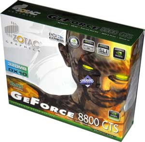
Theme: Badly Scarred Burn Victim.
I’m not sure what I think of this box. On one hand, it’s extremely unprofessional to prominently feature an unskilled render of a charred demon woman with unsettlingly-broad shoulders on the front of your box, but one the other: At least it’s not a stupid glass unicorn.
I remember in college one of the animation teachers had a poster on the wall that said: “Keep it simple, stupid.” I could never figure out if the poster was calling you stupid while also telling you to keep it simple, or if it was saying that you should keep it simple as well as stupid. That isn’t relevant, but it crossed my mind just now.
Grade: A
Design:
The lines are clean and it’s not too busy; the soothing white and green compliment seared hellflesh surprisingly well. Well played Zotac, well played…
Grade: A-
Final Thoughts:
This box is pretty good compared to a lot of the others you see around. If you think about it, putting this box in this roundup is kind of like putting a guy who accidentally brushed against a kid’s genitals into a prison cell packed with serial murderers: You might not let him babysit your toddler but hey, at least he isn’t as bad as the dude who carved up an entire family of four and ate them.
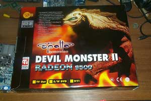
Theme: Devil Monster?
This makes no sense at all. I might be able to stretch my imagination enough to imagine a creature so hideous that it required TWO evil words to describe it (a devil so evil that it’s a monster even among devils?) but the picture screws it all up because it’s the creature from the black lagoon! OK, so they had a picture of “The Creature” just lying around to use royalty free, so they decided to use it for their Devil Monster II box, I guess that’s not a crime. But what bothers me is that they tried to cover this fact up by putting a bunch of fake fire around him and calling him a devil. That isn’t going to fool anyone.
Also the Creature From The Black Lagoon doesn’t even come close to deserving the name Devil Monster. All it does is drown some of the people who happen to swim in the black lagoon. Who cares about these people? Maybe don’t go swimming in a place called the black lagoon that is known for drownings, idiots.
Grade: F
Design:
Screw you Apollo Graphics!
Grade: F
Final Words:
…I…I’m sorry Apollo Graphics; I just can’t stay mad at you. Let’s make up and be friends again. Hey everyone, look for Apollo Graphics products at an electronics retailer near you, they really are great folks.
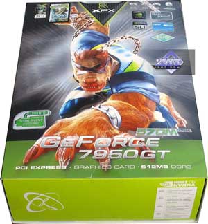
Theme: What?!
Grade: D
Design:
XFX design meeting transcript:
| Graphic Designer 1: OK, so we’ve got to come up with a character to put on the new 7950 box. Graphic Designer 2: Hey, what about a werewolf, nothing says cutting edge graphics like lycanthropy! GD1: Hmm, you might have something there… but we need more, something to punch it up a bit, give it some zaz! GD2: Zaz sir? GD1: You know: Zaz! Hep, pep, kick! GD2: What about a Zorro mask!? GD1: I love it! Zorro’s big these days, kids dig him! Wins friends and charms snakes! What else you got? GD2: Umm, well I was thinking sort of like a chain coming out of a spiked collar, you know, because he’s a wolf. GD1: Brilliant, and he could be crouched towards the viewer, ready to pounce out and strike with the power of cutting-edge graphics at any moment! GD2: Yeah, yeah, but wait just a minute, there’s more- he’ll be wearing press-on nails and lipstick, ha-cha-cha! GD1: It’s bold, it’s brassy, it’s sassy, and by god, I get it! We’ll have a monopoly on gender-nonconforming werewolf lovers everywhere; those mugs at ATI won’t stand a chance. GD2: Mwahahahahah! GD1: BAAAHAHAHA! GD2: Hohohohoho! GD1: (Blows own brains out) GD2: (Devours human infant) |
If you ignore the absurd jersey-clad werewolf seductress (impossible I know) this box isn’t horrible. It’s got the green thing going along the bottom edge to show that the card is from Nvidia, and the color scheme is fairly pleasant. Not so sure about the wavy black sunburst thing in the back though. It looks more like the background to a “Footprints in the Sand” religious clock that my grandma had in her kitchen, not a place that a some dumb wolfman wolf would hang around in.
Grade: C+
Final Words:
Hey XFX: If you want more actual adults to take your company and its products seriously it might be a good idea to stop putting goofy pictures of what look like Bucky O’Hare action figures on the front of your boxes.
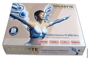
Theme: Cyborg Fairy Princess
It seems I may have spoken too soon when I said that a unicorn was the lamest mythical creature. A fairy princess is significantly lamer. Yeah, I see you’ve tried to make her “cooler” by giving her mechanical wings (and a mechanical bra?) but there isn’t much you can do to cool-up a stereotypical fairy.
Honestly, if you’re going to insist upon using a picture of a fairy, here’s a suggestion about how you can make it more appealing to nerds: Give her a gigantic rack. It may seem like crude lowest-common-denominator pandering (and it is) but putting some huge sweaterhogans on the package really is a great way to get your product noticed (and purchased) by lonely freaks. Because hey, who else is really buying 450 dollar video cards? (Editors note: I have, on numerous occasions purchased video cards at or near this price point.)
Grade: D
Design:
You’ve got your fairy princess with arms spread wide as if to say “I am an empowered woman; watch me soar!”, pink newborn baby girl background, chocolate foil wrapper gold Gigabyte logo, and the card’s features displayed inside what appear to be four little Midol capsules. Cute!
Grade: B+
Final Words:
Please note that I realize that there women out there in the world who buy video cards. But for the purposes of humor, I have set this article in a world in which only young men do so.
Done.